Hello - I took an unintended long break from writing.
It all began when I decided to do more knowledge stories like the story of as-if theories, because it was immensely fun to write and beautifully insightful in general. 27 days later, I have done many things except finish a knowledge story. (I have also just turned 30, but that is irrelevant to the topic of Growing Meta). So I decided to return to what I was doing: sharing the most interesting papers I stumble upon, and only writing stories when they evolve spontaneously.
This month, I was reading on how people seek information when there is no clear purpose. This is helpful in designing any information space, like the web, a dashboard, an online library, or even a real library.
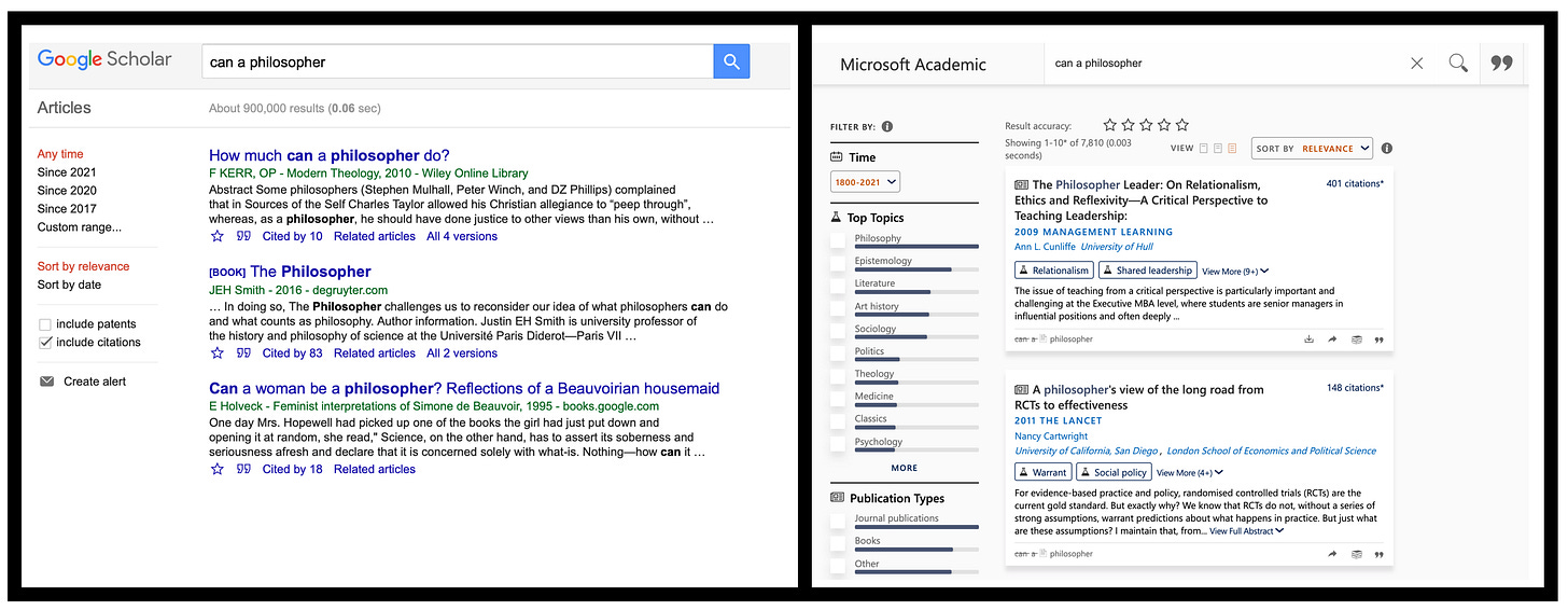
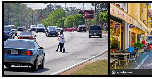
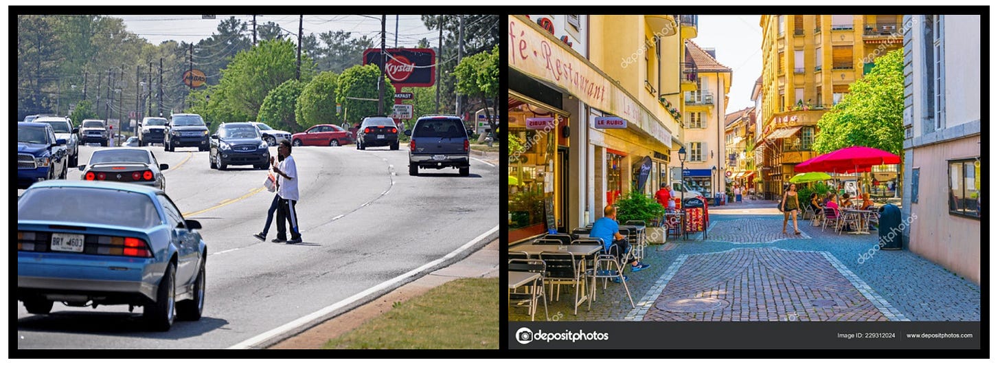
Information is cheaply available, extensively accessible. But a lot of interfaces are bland. They do not encourage fulfilling exploration. Example: despite Google Scholar’s superb searching capabilities, you have very limited paths to any paper. You can only be creative with your keywords. But in Microsoft Academics, I can actually access the best papers in a Topic. This is precisely like exploring a city or a village: you can only walk as far as the roads are connected in a meaningful way.

That’s precisely the analogy that was established in an influential research paper released in 2011 [1], where three authors from Calgary University compare an information seeker to a flaneur. A flaneur, as shaped in literary works, is a “an urban wanderer, who leisurely walks through streets and squares interpreting and re-imagining the city”.
In the paper, they examine the research on cognitive and perceptual skills of the information seeker and attempt to establish some theory on information design practices, like treating the information seeker as a poetic persona who likes to reflect on the information and imagine narratives based on them — though the paper focuses more on theory and exploring information seeking from a flaneur’s own thoughts and behavior and less on actual practices.
Despite wanting to read more on how best to design good information interfaces, I loved the analogy they presented.
If complex systems (like cities and information webs) were human, they would have different races, but they all will have roughly the same genetic makeup. By zooming out we can understand everything in new ways.
Best,
Najla
[1] Dörk, Marian, Sheelagh Carpendale, and Carey Williamson. "The information flaneur: A fresh look at information seeking." Proceedings of the SIGCHI conference on human factors in computing systems. 2011.


